Campus Rec Style Guides - Case Study
When the Bronco Recreation and Intramural Complex (BRIC) opened at Cal Poly Pomona in 2014, it more than doubled the marketing workload for Associated Students Inc., Cal Poly Pomona (ASICPP). ASICPP is made up of many departments offering a wide range of programming and services to students of Cal Poly Pomona. Campus Recreation, the ASICPP department that runs the BRIC, also emanated from this opening.
There were four programmatic areas of focus within Campus Recreation in 2014: Adventures, Aquatics, Fitness, and Intramurals. Since then, it has grown to include Sport Clubs, Scuba, and Youth Programs. Out of necessity, the Marketing, Design, and Public Relations (MDPR) department developed and implemented style guides to manage the workflow, and they’ve been evolving ever since.
The four Campus Rec programs were addressed separately when style guides were first introduced. Each program received its own style guide, which was developed independently from the others. See examples below.
Over time, we identified issues with this method. Not only was it difficult to maintain four unique styles in addition to all the other programmatic and departmental needs, but it was also very time consuming to develop.
Examples of previous styleguides created for the BRIC’s programmatic areas
Adventures Program Marketing
Aquatics Program Marketing
Fitness Program Marketing
Intramurals Program Marketing

In 2017, I worked closely with Campus Recreation and my design team to unify all programs under a single style guide. We identified three key areas that needed to be addressed: 1) categorizing the importance of a project, 2) establishing a clear timeline for design work, and 3) defining the visual voice of Campus Recreation. With this in mind, my team and I created the "Peg and Box" system—a modular grid and information structure that allowed for versatile placement of both copy and images.

Photo credit: Andrew Phan
The “Peg” system
The “Box” system
The categorization of projects became crucial, as it was directly tied to the design time required. One recurring issue in our department was the time it took to complete marketing materials for programs that could only accommodate a very limited number of participants. On multiple occasions, we were asked to create fully illustrated posters for programs with only a dozen available spots. Often, by the time the marketing materials were finished, the seats had already filled up.
To address this, we developed a scale chart based on the number of participants. Small-scale projects were for 1–14 participants, medium-scale projects for 15–99 participants, and large-scale projects for events or programs that could accommodate 100+ participants.
This categorization also helped us manage time expectations. Small-scale projects would only require a few hours to complete (assuming communication was clear), while large-scale projects could take weeks.
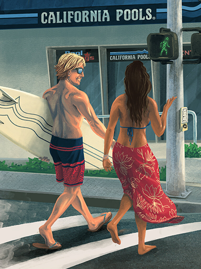
The visual voice had really been developing since we started style guides back in 2014. We found that photography and clean typography were the answer to what the design should be, and we applied these to the small and medium-scale styles. This, however, left illustration out of the question.
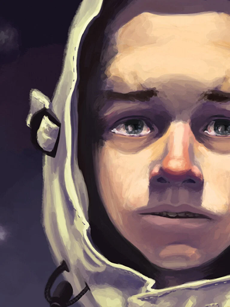
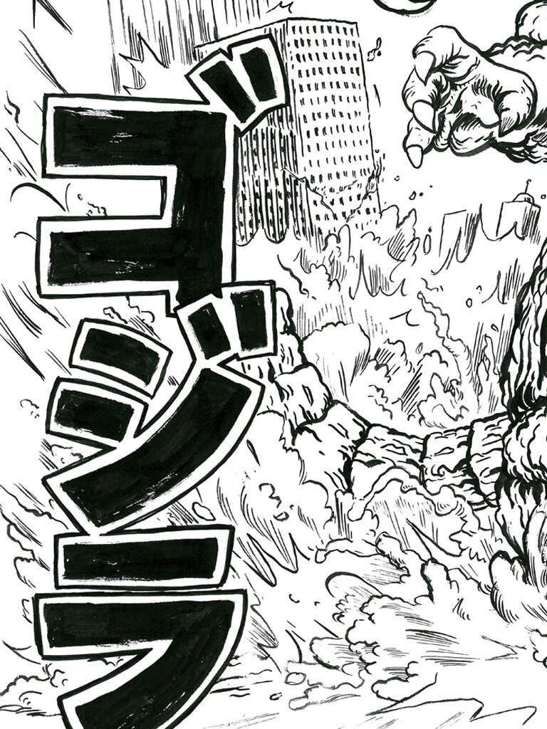
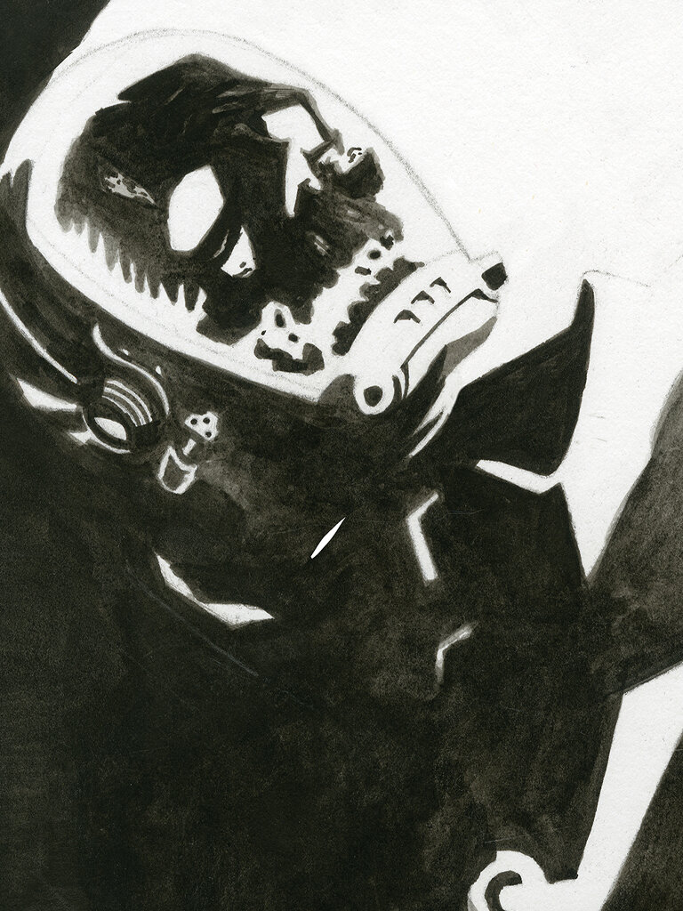
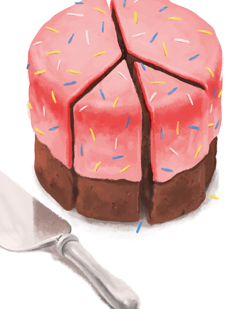
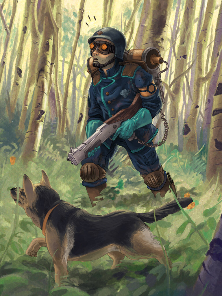
Illustration had long been a go-to for our Adventures program and was greatly valued throughout Campus Recreation. It had also been one of the causes for the scale system because it required so much time to create.
Due to the nature of large-scale events and their infrequency, we deemed it appropriate to break away from the systems of the style guide. This allowed the designers and the programmers more freedom and for illustration to still be an option!

Small-scale
Key features:
monochromatic imagery that has been masked out
complementary vector design elements
black or white box structure built with outlines (except for the primary zone)
The New Styleguide

Medium-scale
Key features:
full-color photography with no masking
complementary vector design elements
color box structure with negative space in place of outlines

Large-scale
Key features:
no rules!
work with the requestor to create something unique
intentionally differentiated from small and medium-scale styles
The Booklet
We worked to differentiate the look of small- and medium-scale projects while keeping certain elements consistent, notably the "Peg and Box" system. The design team and I also selected curated fonts that could be used across both scales.
Fonts and type treatments
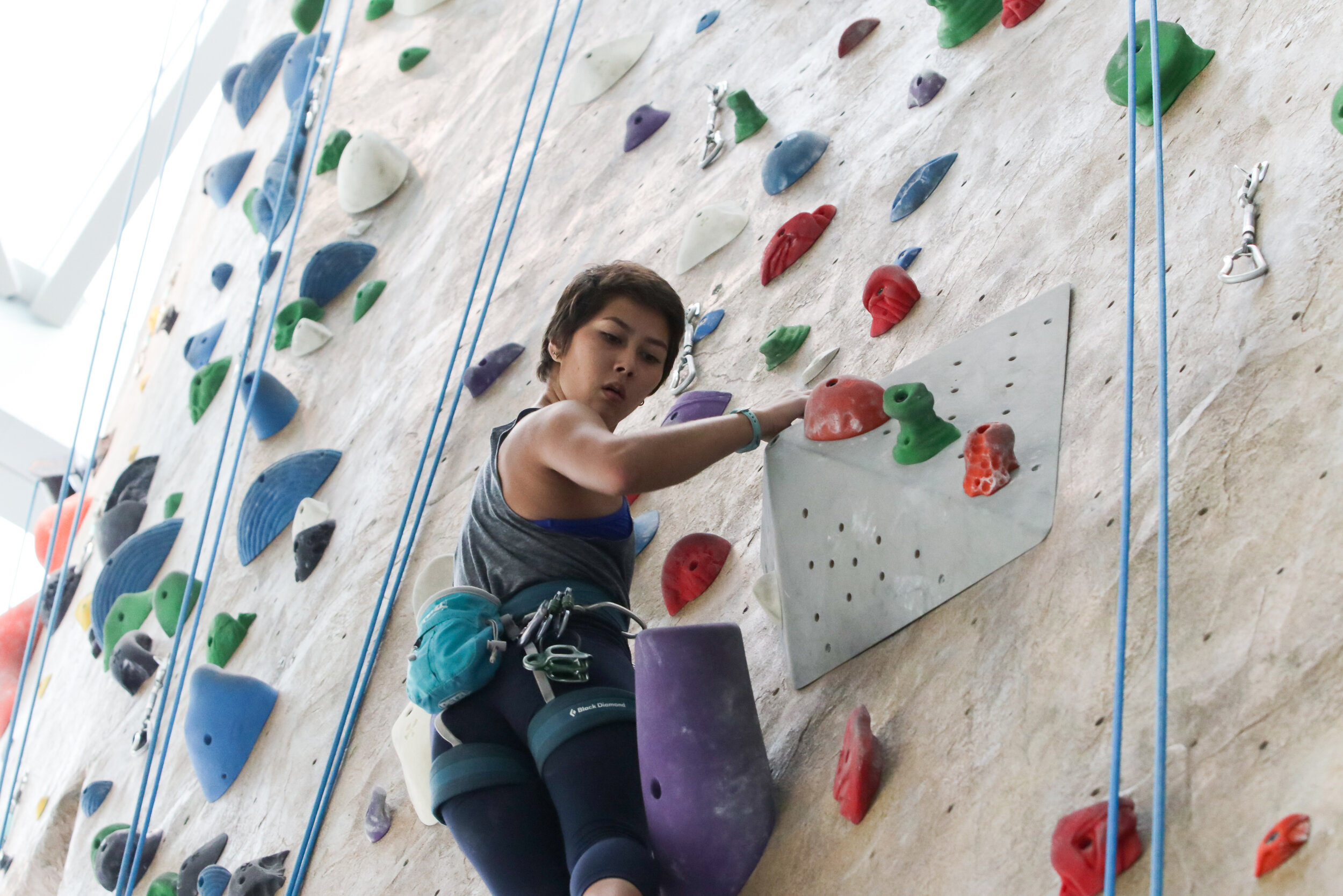
Photo Credit: Alex Estrada
Box system and how to construct it
Hype Posters
After completing our first semester’s worth of marketing with this new style guide, my team and I prepared a pitch to bring illustration back to the BRIC in a fun and engaging manner. We called them Hype Posters.
Our goal with these posters was not to just bring illustration back. In fact, our primary objective was to take the photography and clean typography of the new style guide and build out a visual counterweight with strong illustrations. Our secondary objective was to target specific events and programs to build hype around them.
I created this Skate 101 & 202 concept design as a way to help my team visualize other concepts that we could include in our pitch. We took smaller events that we felt would be good candidates for “hyping” up. Being mindful that cost could easily deter Campus Recreation away from the idea, we included mockups of how we could produce these in-house with our existing equipment.
Poster Design and Illustration: Chad Lynn
Poster Design and Illustration: Adrian Arvizu
This whole process has continually been an experiment in branding and storytelling. With each new iteration of the style guide we’ve refined, honed in on, and better understood what story we’re really telling with Campus Recreation. With the recent rebrand of the organization (more on that here) I’m looking forward to taking what we’ve started with Campus Recreation and expanding it to include the whole brand of ASICPP!
The pitch was rejected by Campus Recreation. Looking back, I believe we hadn’t given ourselves enough time to fully experience the new style guide. Additionally, I learned shortly after the rejection that our design goals and those of Campus Recreation weren’t fully aligned. While it was disappointing not to move forward with the hype posters, after gaining a better understanding of Campus Recreation’s objectives, it made sense to hold off for the time being.

Art Direction, Design, and Copywriting: Dustin Glauser | Lead Design: Cody Guerrero | Designs: MDPR Design Team | Photography: MDPR Photography Team
Artwork and photography © 2024 ASI, Cal Poly Pomona